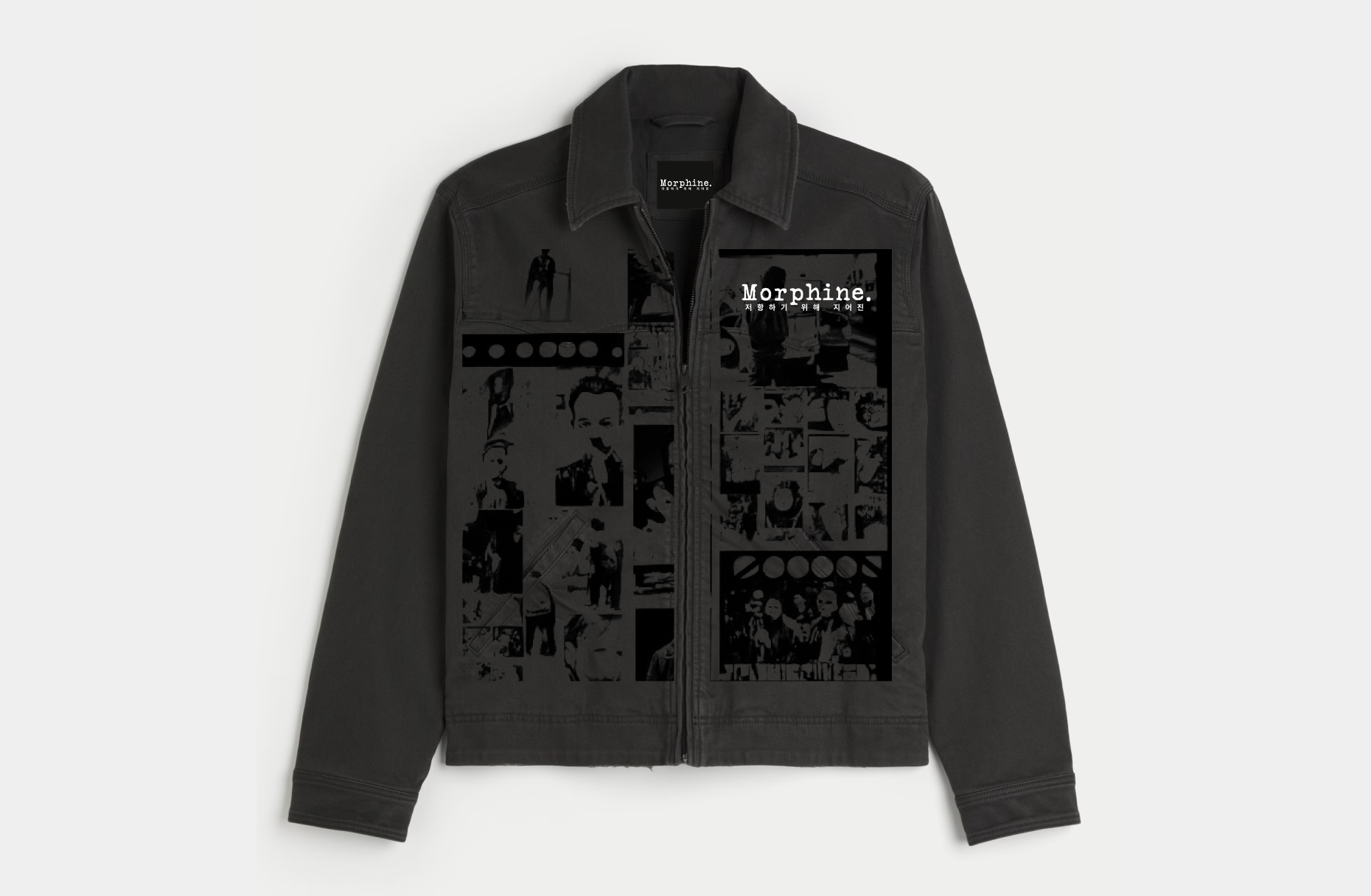
THE GOAL WAS TO DELIVER A COMPREHENSIVE BRANDING SYSTEM WITH A WORKING CLASS EDGE WOVEN BETWEEN EACH THREAD AND FIBRE.

Tasked with a website update, packaging, and promotional materials for their drop-based release schedule, we started by thoroughly breaking down the vision the client had for their brand. The brand already had a wordmark, with a rudimentary website set up to start with. Very counterculture, with sustainability and production ethics in mind (MORPHINE produces all their products domestically, relying on minimal outside interference in their labour practices and values).
I crafted a very texture-oriented visual identity that pulled from the material selections featured in older Korean newspapers, punk editorial magazines, and use of recycled materials. The packaging, in particular, was designed to utilize recycled paper and minimal ink to create a hand-crafted aesthetic for branded delivery packaging (Being a primarily E-Commerce based business).


Our final deliverables included a DIY-inspired E-Commerce experience, and print-ready packaging samples/patterns to be utilized across garments/bags/packaging alike. Also included were signage samples to further illustrate the creative potential of these textured prints as a wider means of "world-building" within the Morphine brand.
What originally was presented as technical constraints in the brand's production methods were reapproached as an opportunity to embrace the Punk-Rock roots of the brand's initial inspiration. Second-hand materials were flipped from a liability to a unique commodity, proving once more that brand experience and ideology dictate the majority of how fashion is interpretted by consumers.
PRODUCTION COMPANY BRAND ACTIVATION
WEB+SOCIAL DESIGN SYSTEMS
2023
